
Pick a style by matching the structure of your content, not by aesthetic preference. The four layouts below cover almost every sketchnote you'll ever need to make.
The four styles, one paragraph each
Classic is the default — a balanced page with a hand-drawn title, 4–8 ideas in framed sections, icons, and arrows. Works for book summaries, lecture notes, meeting recaps. If you don't know which style to pick, pick Classic.
Timeline arranges content along a horizontal or vertical axis. Sequential content: history, processes, product roadmaps, recipes, customer journeys.
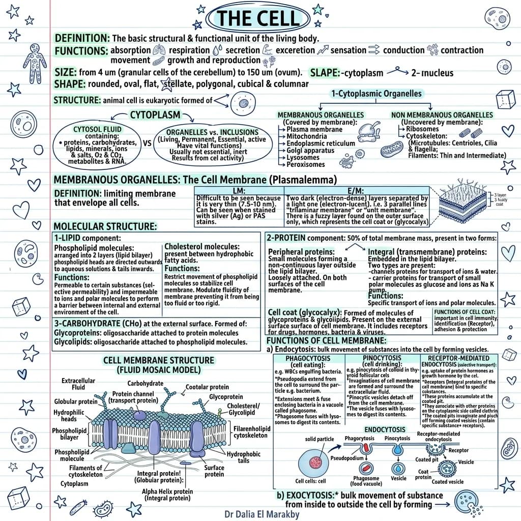
Blueprint uses a technical-drawing aesthetic — measured frames, callouts, precise lines. System diagrams, product specs, architecture decisions, anatomy.
Kanban divides the page into columns. Comparisons, pros/cons, before/after, status boards.

Classic style examples (1–10)
- Book chapter summary — “The 7 Habits, Chapter 1”
- TED talk recap — speaker's big idea + 3 supporting points
- Podcast notes — 90-minute interview as a one-page brief
- Lecture notes — single sketchnote per class
- Meeting recap — share outcomes with people who weren't there
- Blog post visual — same article as a LinkedIn-ready sketch
- Newsletter weekly summary
- Conference talk notes — one per session
- Workshop takeaways — 4 hours, one page
- Personal reflection — distil this week into one image
Timeline examples (11–17)
- Company history — founding, milestones, pivots
- Product roadmap — quarterly themes left to right
- Customer journey — awareness → consideration → purchase → retention
- Onboarding flow — day 1, week 1, month 1, quarter 1
- Historical event timeline — WWII, French Revolution, internet history
- Recipe or procedure — raw ingredients to plated dish
- Incident postmortem — detection → triage → fix → prevention
Default to Classic. It works for 70% of inputs. Reach for the others when your content has obvious structure.
Blueprint examples (18–24)
- System architecture — services, queues, databases
- Product spec — components, dependencies, success metrics
- Anatomy diagram — labelled parts of a cell, organ, or system
- ADR summary — context, decision, consequences
- Mechanical or industrial design — exploded view
- Network topology — devices and connections
- API endpoint map — routes, methods, payloads
Kanban examples (25–30)
- Tool comparison — Notion vs Coda vs Obsidian
- Pros and cons — two columns, balanced bullets
- Before / after — old workflow vs new
- Roles and responsibilities — who owns what
- Pricing tiers — Free vs Pro vs Enterprise
- OKR scorecard — green / yellow / red status
How to choose a style
- Default to Classic. Works for 70% of inputs.
- Timeline whenever the content has an order.
- Blueprint when the audience expects rigour.
- Kanban whenever you're comparing things side by side.
- When unsure, generate two and compare. The right one becomes obvious.
Frequently asked questions
Where can I see live examples?
The visual examples gallery shows 14 real generated sketchnotes.
Can I customise colours or icons?
The current AI picks from a curated palette to keep the look consistent. Custom palettes are on the roadmap.
Sketchnote vs infographic?
Sketchnotes feel hand-drawn and personal; infographics tend to be polished. A sketchnote infographic blends both — see the complete guide.
Are the examples here AI-generated?
The examples described are use cases. You can generate any of them yourself in under a minute.


